
💥BANG💥 BLAM💥KABOOM💥
A recent trip to the local fireworks shop resulted in a master class in package branding – both good and bad. Some really, really bad.
You see, for most people fireworks illuminate a fear or excitement centered around a single-second explosion in time. It’s bright and vivid. It’s a split second. And it’s also easily forgettable. Therefore, fireworks packaging has to make a big first impression. It has to make a big bang.
So, just in time for Fourth of July, check out these fireworks packaging designs — some of which will surely blow your mind.
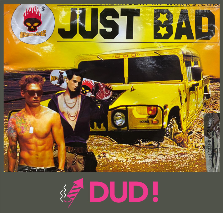
JUST BAD
There’s nothing more badass than a couple of bros holding skateboards with a big yellow Hummer bursting through a mud puddle right? WRONG.
The name says it all – just bad! Inconsistent and random. Too busy. Also, Branding 101 suggests giving your product a name that positively differentiates you from the competition, and this does the opposite. But, let’s be real – there’s something strangely magnetizing about being the bad boy – so congrats Megabanger, we didn’t love your fireworks packaging design, but we still bought it.

PIRANHA
Can you think of anything more terrifying? There you are, wading in the water on a warm summer day when a flesh-eating piranha starts nibbling on your kneecap. NOPE!
This one wins big because it achieves a ‘simpler the better’ approach. Scary ass fish, big and bold in your face. Kudos to whomever handled the packaging design for this fireworks brand – Cutting Edge Fireworks – you kind of killed it.

EVIL CLOWN
AHHHHHHHHHHH. Clowns are legit scary. Think about it. Everybody knows somebody who is scared of clowns. Especially ones with sinister-looking makeup, a half-burnt stogie, and what appears to be some ill intentions. Yikes.
The clowns (kidding) from World Class Fireworks win with a fireworks package design that is simple and scary — with messaging that clearly conveys to a consumer what they’ll get: 9 FLAMING BALLS SHOT INTO THE SKY.
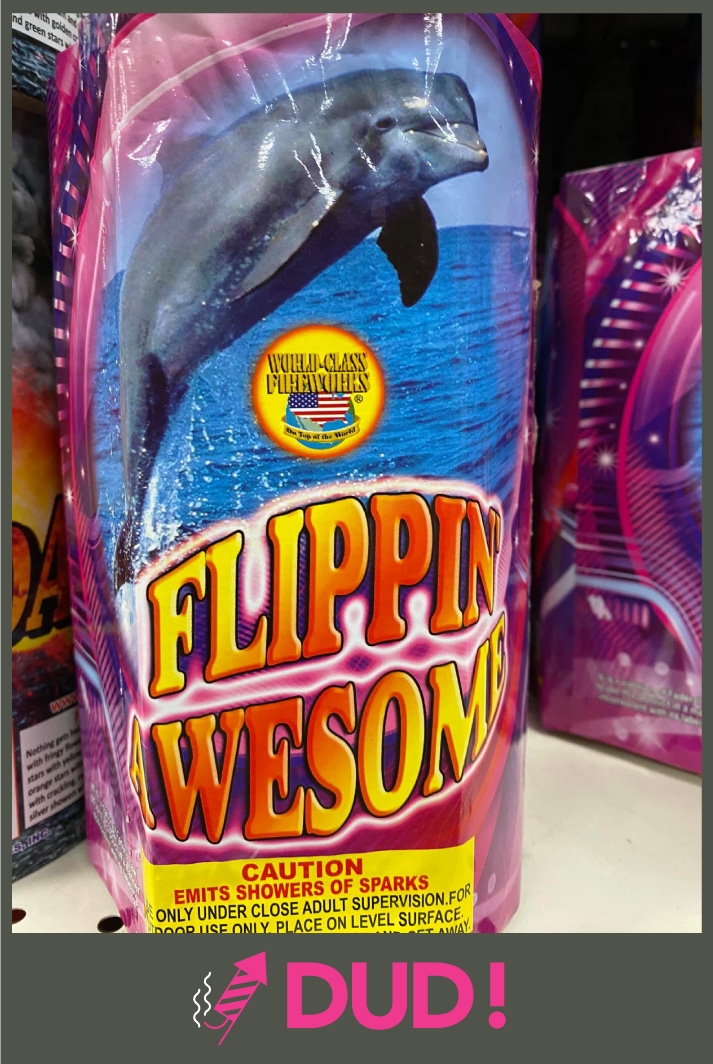
FLIPPIN’ AWESOME
Well. They tried. I guess this packaging design works if you equate the thrill of fireworks to that of a majestic dolphin swimming freely through the wide open sea. Ehhh…It’s kind of a stretch.
Another creation from the team at World Class Fireworks, this one is a little fishy – but still deserves extra credit for its out-of-the-sea approach.
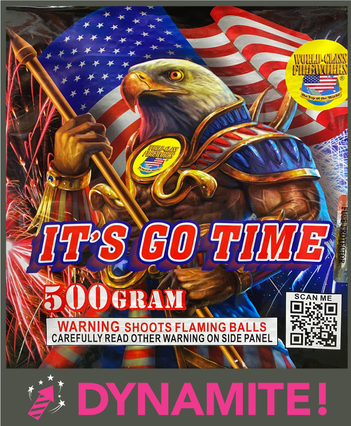
IT’S GO TIME
A herculean half-man/half eagle draped in patriotic apparel clutching a golden spear while fireworks explode and Old Glory flows in the wind. SOLD. Seriously, it’s GO TIME!
Surprise – another winning design from World Class Fireworks – this one immediately goes in your cart because it screams at you – THIS IS FOR AMERICA and EAGLES ARE AWESOME.

FLICKER
A sultry looking lady holding a Zippo lighter while the twisted wreckage of a freshly blown up automobile hangs in the background. No idea what’s happening here. It seems bad though. It seems like something you don’t want to do when lighting off fireworks.
It just so happens this fireworks design is yet another from the quiver of World Class Fireworks – apparently, they have the market cornered on cool and kind of cool fireworks packages.
WHY STANDING OUT ON SHELF MATTERS
When it comes to fireworks – consumers know what they like it when they see it, but can’t remember the name on the package a single second after watching it go explode!
Brands win when they go minimal. Brands when they differentiate themselves by not trying to over-design. Brands win when they make themselves different. Not just yell louder than the others.
Want to have a blast working on your next packaging design project? Get in touch.